
What is Technical Analysis?
Key Takeaways
- Technical analysis is a technique of exploring securities investment and trading opportunities solely by analyzing statistics caused by market activity.
- Technical analysis extracts the need to evaluate other market influences like the fundamentals, market psychology, and macroeconomic events.
- Technical analysis tools should not be applied by themselves and are most useful when combined with other tools.
Basic assumptions of technical analysis
Technical analysis is a technique of exploring securities investment and trading opportunities solely by analyzing statistics caused by market activity, including price history and volume. Technical analysts assume markets are efficient and the chart values reflect the factors influencing a security price and do not need to analyze the intrinsic value of an asset separately.
This technique has been around in various forms as early as the 17th century when Dutch traders applied it to speculate on different trading goods. However, the most notable development took place when a Japanese rice trader used it with candlestick charts in the early 18th century.
Today technical analysis can be applied to any stock, bond, good, or cryptocurrency, which is publicly traded by small retail traders as well as well-established financial institutions and especially in quantitative trading models. However, it should be noted, that most research around technical analysis is still focused on traditional assets and cryptocurrency-focused technical analysis is still emerging. So, let's dive into some base assumptions:
Assumption I: The market prices in everything
Technical analysts assume the price of a security at any given time reflects the aggregate of factors influencing that security, including the fundamental aspects, market psychology, and macroeconomic factors. Rather than analyzing the factors above individually, technical analysts study price movement, which is viewed as the result of market supply and demand.
Interesting to watch up to through the merge https://t.co/B65fAVAoN4 pic.twitter.com/eUAoMsjuDY
— Lionel Lightcycle (@0xLightcycle) August 15, 2022
Assumption II: Price moves in trends
Technical analysts assume prices move in trends even in random markets and timeframes. Most technical trading strategies assume that a security's price will continue in its established direction than against it.
#btc 2hrly. pic.twitter.com/gXxZuZ5Pox
— Solokov (@Solokov_Sats) August 10, 2022
Assumption III: History tends to repeat itself
Despite the centennial age of most technical tools, they are still used by analysts to this day. This is because of the assumption that price patterns tend to repeat themselves. This assumption is based on market psychology. Market participants tend to react similarly in familiar scenarios, creating recognizable price patterns.
V shaped pic.twitter.com/UrvLtdPc3T
— PlanB (@100trillionUSD) August 13, 2022
How to perform technical analysis
The iterations of technical analysis are virtually endless. There are as many variations of technical analysis as they are analysts, as these processes are often customized to fit the analyst's preferences. However, they often follow the same fundamental guidelines, which are:
Identifying the trend
The first step in most technical analysis is identifying the trends. The market trend is the overall direction of the market, which can be upward, downward, or sideways. After the trend has been established, there are primarily two types of strategies that follow. One, trading along the direction, referred to as trend strategies; two, trading against the direction, referred to as counter-trend strategies. There is no objectively right or wrong choice here; it depends mainly on the applied trading strategy.
Drawing support and resistance levels
Support and resistance are levels on a price chart that signal a high chance of price movement in a specific direction – this could be a reversal or a breakout. Support levels are low levels that indicate declining momentum in price downtrend due to increased demand or buy orders. Conversely, resistance levels are high levels that indicate momentum loss in price uptrend due to increased supply or sell orders.
Establishing entry and exit points
After establishing a trend bias using the above steps, the next item is determining a specific point to enter and exit the market. This stage involves looking for additional confluence using indicators and chart patterns. Indicators are trading tools that draw lines and patterns on the chart to make trading decisions clearer and more objective. Some popular indicators frequently used by technical analysts are Moving Average (MA), Relative Strength Index (RSI), Average True Range (ATR), Stochastic, etc.
Position sizing and risk management
Lastly, technical analysts set their stop-loss and take-profit based on the desired risk-to-reward ratio. The risk-to-reward ratio calculates how much profit an investor can make for every unit of an asset risked in an investment. This analysis phase helps determine when to walk away with your earnings (should the trade go in your favor) or cut your losses (should the trade go against you). Risk analysis tools include indicators such as ATR and the inbuilt stop-loss and take-profit functions on most reputable exchanges.
Chart Analysis
Chart analysis examines the price developments and course formations of charts, i.e., the historical price developments of securities. The aim is to make a concrete statement about the future price development of the underlying security. When analyzing individual companies, the fundamental data are completely ignored. The chart analyst is interested in typical price formations, supports, and resistances in the price trend. The goal is to find the optimal time to buy or sell. Although the theoretical relevance of chart analysis has not been proven, many investors attribute a very high significance to it.
Many assume that the market is always in an upward or downward trend. However, the market price can move in three directions: down, up, and sideways. A directionless market is called a sideways trend. The three directions of the trend can be further classified into three categories. These categories consist of long-term, medium-term, and short-term trends. So, there is an infinite number of trends that may last only for a few minutes or hours, or even for whole days, weeks, and months. In chart analysis, it is important to recognize the trend correctly, because only then can you identify a reversal formation (change of trend) or continuation formation (the trend remains).
Chart patterns
So, let’s dive into some possible chart formations. Although there are a huge number of possible trends and interpretable chart positions, they can differ in only two categories:
Reversal Formations
These formations indicate that a trend is likely to reverse. The prevailing trend changes and a reversal formation is formed. Resistance and support are often used in this context. A support is a price area below the current price, where higher demand will slowly exceed supply. This stops a further price decline. Resistance is the direct opposite of support. Resistance is a price barrier and can stop the price from rising. In this area, supply slowly exceeds demand and the price stops rising. The most notable examples are double and triple tops or bottoms.
Continuation formation
These chart formations are also called trend confirmation formations. Continuation formations indicate that subsequent price movements are moving in the same direction as the previous trend. The pennants and flags are very common formations of this category.

Candlesticks
The candlestick (candle chart) has its origins in Japan. In the 17th century, a rice trader from Osaka developed the candlestick chart method and used it successfully. Today it has been applied to display more sophisticated charts, which also depict price changes within a period.
The candlestick chart consists of a body and a wick. The body is marked by the opening and closing prices and the wick above the candlestick body forms the high price of the period under consideration. The wick below the candlestick body marks the low of the period.
Candlestick A, the white candlestick, indicates that the closing price is above the opening price (Prices have risen.). If the closing price is below the opening price, the candle turns black (Prices have fallen.).

The representation of a candle contains a lot of information and can be used to make predictions about the future price development of a security.
Technical indicators
So, let's discuss the most notorious tool of Technical Analysis: The technical indicators. There are thousands of options when choosing a technical indicator with an exponentially higher number of possible combinations. They are applied by small traders and big institutional investors and often find an application in automated trading systems. Nevertheless, there are clear limitations in their informational value especially when applied singularly. John Bollinger, the notable creator of the Bollinger Bands, recommends applying them only with indicators that use different types of data.
There are two basic types of technical indicators:
- Overlays, technical indicators that use the same scale as prices are plotted over the top of the prices on a stock chart. For example, the Moving Average and the Bollinger Bands.
- Oscillators, technical indicators that oscillate between a local minimum and maximum are plotted above or below a price chart. For example,the MACD or RSI.
In the following, we want to introduce you to 4 of the most used technical indicators, which you can find applied for our listed addresses on Polygon and BNB chain in the corresponding Dune dashboards.
The Relative Strength Index (RSI)
The RSI is a momentum indicator, which measures the speed and magnitude of the price change to evaluate whether it is currently overvalued or undervalued. It can also indicate trend reversals and the connected price jumps or pullbacks.
How is it calculated?
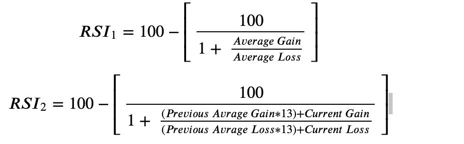
How do you read it?
The RSI is moving between 0 and 100, whereas traditionally 70 and above are considered as the ‘overbought’ zone and sub 30 as the ‘oversold’ zone. These, however, should not be understood as hard caps, especially in highly volatile markets, as crypto RSI values of 90 or 10 might not be unusual.
Bollinger Bands
The Bollinger Bands are an overlay Indicator, defined by two trendlines, which rely on two standard derivations away from the simple moving average.
How is it calculated?
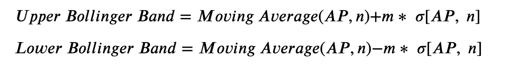
Where:
AP (Average Price) = (High + Low + Close) / 3
n = number of days in smoothing Period (normally 20)
m = Number of standard derivations (normally 2)
σ[AP, n] = Standard Derivation over the last n periods of AP
How do you read it?
The Bollinger Bands are made up of 3 graphs: the 2 actual Bollinger Bands and the simple moving average. Most commonly it is interpreted that the closer the price is to the upper band, the more overbought the market, and the closer to the lower band, the more oversold the market.
As they are an overlay indicator, many users identify certain patterns similar to the chart analysis. Firstly the ‘Breakout’, when the price breaks out above or below the bands, and secondly, the ‘Squeeze’, when the bands move closer together, can indicate a period of low volatility.
Aroon
The Aroon is mostly used to identify trend changes in the price and the strength of a respective trend. trend. Overall, it attempts to signal the time between highs and the time between lows, which is based on the assumption that uptrends see new highs regularly and downtrends new lows. The Aroon is showing when this is happening and when not.
How is it calculated?
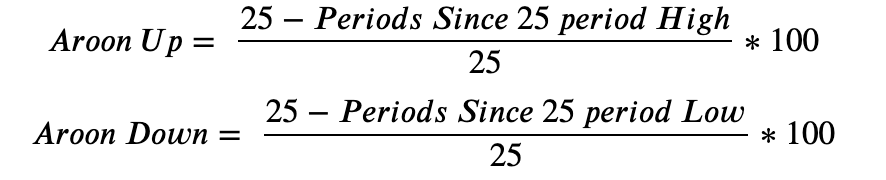
How do you read it?
The Aroon consists of two lines, an upper one, which measures the number of periods since a high, and a lower one, which measures the number of periods since a low. Both lines move between 0 and 100, where 100 is a strong trend, and 0 is a weak one. As the indicator is usually calculated for 25 periods a value of 50 means that there has been a new high/low within the last 12.5 periods. Both lines crossing is usually interpreted as an entry or exit point.
Moving Average Convergence Divergence (MACD)
The MACD is a momentum indicator that shows the relationship between two moving averages of a price, i.e., the 26-period and the 12-period average price. The 9-day EMA of the MACD is called the ‘Signal Line’.
How is it calculated?

How do you read it?
The Signal Line crossing above the MACD line is usually considered a sell signal, whereas crossing the MACD line down is considered a buy signal. Furthermore, there are 2 crosslines in the traditional indicator reading at 2 and 0. MACD values above 2 are usually considered as overbought and sub 0 as oversold.
For further information on technical analysis, check out the following resources:
- https://dune.com/fraxon/technical-analysis
- https://dune.com/beetle/nft-technical-analysis
- https://planbtc.com/20220807QuantInvesting101.pdf
Discover SynFutures' Crypto Derivatives products: www.synfutures.com/.
Disclaimer: SynFutures Academy does not guarantee the reliability of the site content and shall not be held liable for any errors, omissions, or inaccuracies. The opinions and views expressed in any SynFutures Academy article are solely those of the author(s) and do not reflect the opinions of SynFutures. The SynFutures Academy articles are for educational purposes or information only. SynFutures Academy has no relationship to the projects mentioned in the articles, and there is no endorsement for these projects. The information provided on the site does not constitute an endorsement of any of the products and services discussed or investment, financial, or trading advice. A qualified professional should be consulted prior to making financial decisions.